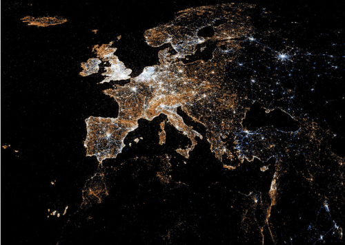
Social media as the pulse of our planet : Visually
Prompted by Hilary Clinton describing social media as a new nervous system for our planet, Patrick Meier (@PatrickMeier) of National Geographic asked, “Can the pulse of the planet be captured by looking at social media activity?”
There are many who are skeptical not least because of the digital divide: “You mean the pulse of the Data Have’s? The pulse of the affluent?” These rhetorical questions are perfectly justified, which is why social media alone should not be the sole source of information that feeds into decision-making for policy purposes. But millions are joining the social media ecosystem everyday, so the selection bias is not increasing but decreasing. We may not be able to capture the pulse of the planet comprehensively at a very high resolution yet, but the pulse of the majority of the world is certainly growing louder by the day.
Meier then went out and found various world maps of social media to make his point.
The below from TweetPing shows what our world would look like if it was lit up with information instead of lightbulbs. The site shows tweets in real-time as they are tweeted across the globe. The platform depicts just 10% of the actual tweets. Hey, I can barely see you guys in Australia.  This is a map of geo-located tweets (blue dots) and Flickr pictures (red dots). The white dots represent locations that have posted to both sites.
  The map below, from Sightmap is heat based and represents the number of photos uploaded to Panoramio, a geolocation-oriented photo sharing website.
  The map below depicts friendship ties on Facebook. This was when there were only 500 million Facebook users, compared to over 1 billion today.
 The below map is check-in’s on Foursquare, depicting not just 500 million single points of checking in, but links between all the other places the people have been.
 People are quick to judge social media as something that makes us less social and less personable. I’m not so sure.